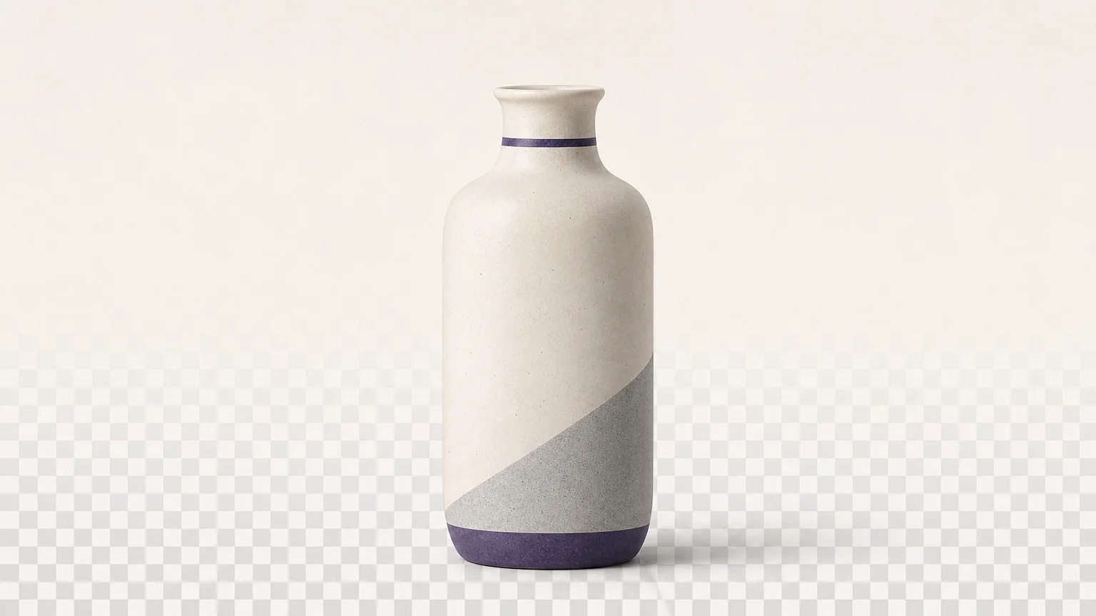


A background color can make a product photo feel cleaner, help a portrait stand out, or bring an image closer to your brand palette. To get a convincing result, first separate the subject from the original scene, then add a solid fill behind it. If you are comparing editing approaches, our roundup of AI background replacers for photos covers options for that workflow.
Choosing a shade is only part of the task. A clean result also depends on how the tool handles hair, transparent objects, thin edges, shadows, and the space between a subject’s arms or a product’s components. Check the editor’s color controls, supported file types, and export options before you begin. That helps you choose a tool that fits your image and produce a file that works in your listing, presentation, or social post.
What is the basic workflow for changing a background color?
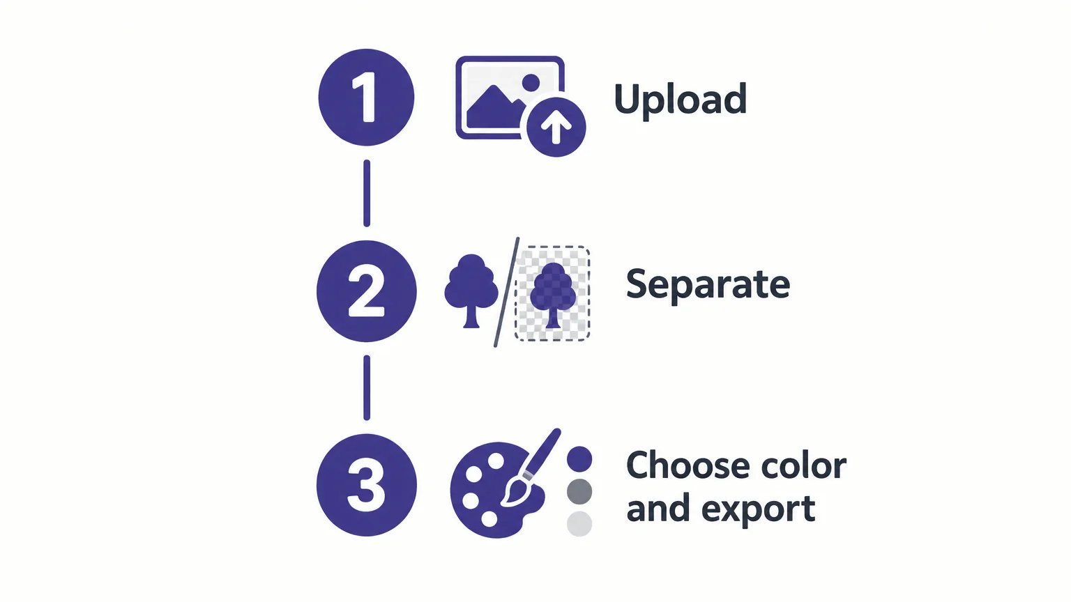
Start with the original image, not a flattened edit that has already lost detail. Upload the photo, use the editor’s background removal or subject selection feature, and wait for the cutout. Then place a solid color behind the isolated subject. Some editors combine these actions in one workspace; others require you to export the cutout and add a color layer in a separate editor.
A 2026 editing survey describes background changes as modifying the background while preserving the foreground subject. That distinction is useful when you assess a result: the goal is not simply to cover the old scene, but to keep the subject’s outline and details intact.
Use the preview to check the whole image, then zoom in on edges and gaps. Look for leftover fragments from the old background, clipped details, or a visible halo around the subject. If the result needs further color design work, our guide to AI background remover tools explains how background removal fits into the editing process.
Which background color should you choose?
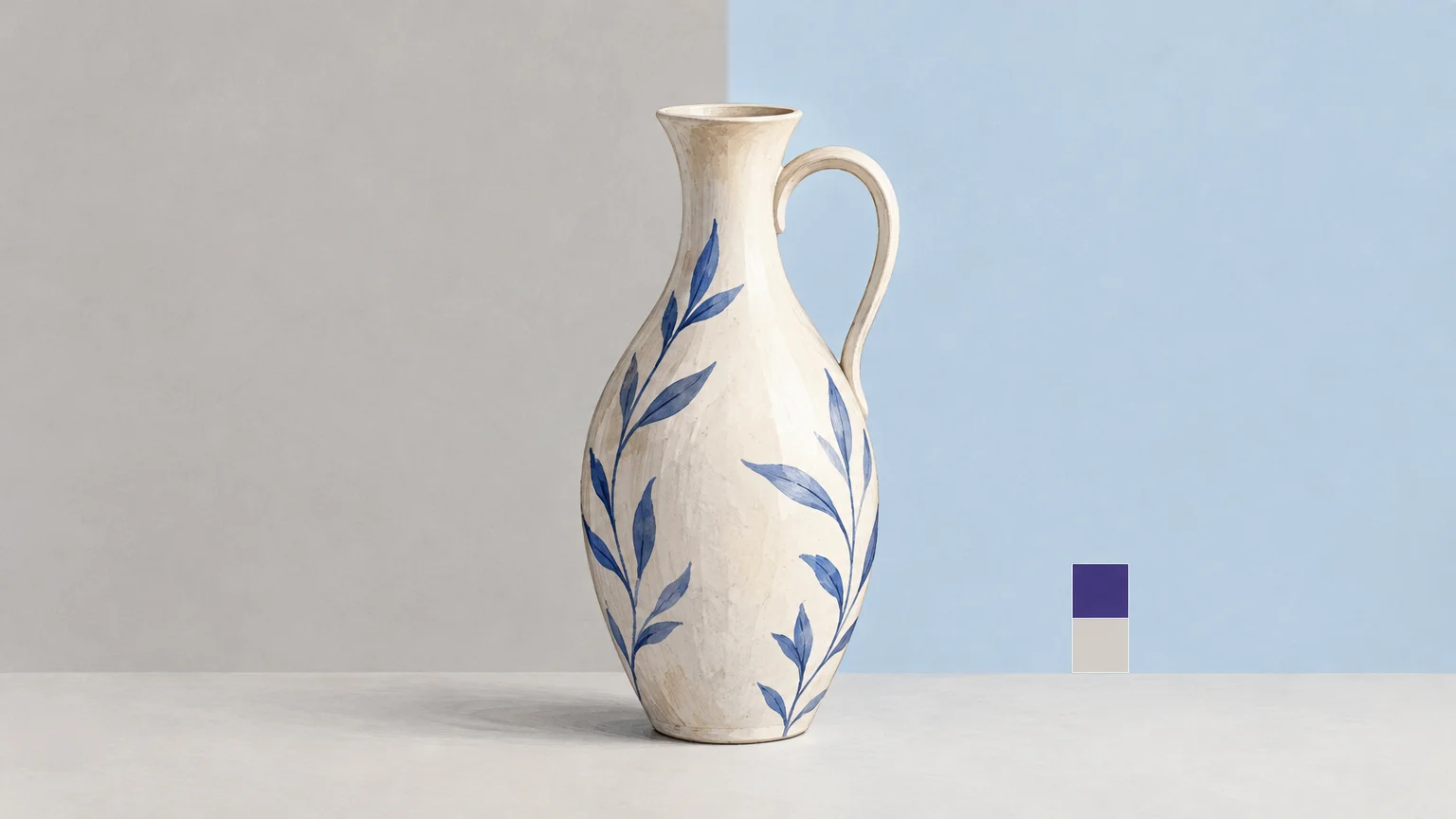
Choose a color based on the image’s purpose and the subject’s appearance. White or a light neutral can give a product image a simple, uncluttered look. A darker shade can create separation for a pale subject, while a muted brand color can make a campaign image feel consistent. Avoid a shade that blends into the subject’s edges or competes with important details.
Color can also look different depending on what surrounds it. The IES color example demonstrates how the same shade can appear different against lighter or darker surroundings. For a practical check, preview your image against the page, listing, or graphic where it will appear. If you are considering a dark backdrop, our article on how to create a black background for any photo offers a focused example.
When you need the same color across several images, use a saved swatch or enter a color code if the editor supports it. Reusing one exact shade is more consistent than choosing a similar color by eye for each photo. For a single image, compare a few options at the final display size before settling on one.
How can you check cutout quality before exporting?
Fine edges are easiest to spot when you inspect the result at a larger zoom. Check hair, fur, glass, jewelry, leaves, thin handles, and spaces between fingers or product parts. These details can be difficult to separate from the original background, especially when the source image is soft, small, or low in contrast.
- Inspect the outline: Look for jagged edges, clipped details, or remnants of the old scene.
- Check the contrast: Preview the subject against the chosen color to spot halos and blending.
- Review the shadow: Decide whether the original shadow should remain, be softened, or be removed.
- Compare with the source: Make sure the edit has not changed important subject details.
For a product photo, inspect reflective surfaces and small components as well as the outer silhouette. A neat outline is not enough if a transparent bottle, shiny package, or fine product detail looks altered. Save the original file separately so you can compare versions or make a different selection if needed.
Which format and settings should you use when exporting?
Choose the export format according to the background you need. A JPG is generally suitable when you want a solid color behind the subject. A PNG is useful when you need a transparent cutout for use in another design. If the image will appear in a listing or campaign, also check its dimensions and file-size requirements before downloading.
Some tools provide color palettes, custom color entry, gradients, templates, or an option to upload a replacement image. Select only the controls you need. If your goal is a simple, uniform backdrop, a flat solid color is easier to review than a decorative texture or gradient.
For product imagery, background choices can affect how the product is perceived. A January 2026 study examined how background and foreground composition relates to image appeal, product perception, and willingness to pay in e-commerce. It does not establish one universally right color, so assess the result in the context of the product and its intended presentation.
What should you check before using an online editor?
Before uploading, confirm the tool accepts your file and offers the output you need. Review its account requirements, usage limits, and any cost displayed before processing. For images containing licensed artwork, logos, or other protected material, use an editor only when you own the content or have permission to modify it.
Also consider whether the editor applies a color directly or only removes the background. A transparent cutout is a useful intermediate result, but it is not the same as a finished image with a chosen color. If the editor exports a transparent PNG, you can place that file over a color layer in a separate design tool.
Make the background fit the image
A polished result depends on more than selecting a new shade. Start with a clear source, separate the subject, choose a color that keeps its outline visible, then inspect details and export the right format. For a dependable online image background color change, review the finished image at the size and against the layout where it will appear.
Start with a clean subject cutout
If your image needs a new color behind the subject, begin by removing the original background. This creates a cutout you can place over a solid fill in an editor with color or layer controls.

Our Remove Background workspace separates the foreground and provides a transparent PNG when removal is successful. The first run of this tool is complimentary. For later cleanup, a verified account and credits are required, with the credit requirement shown before processing. Remove an image background online to prepare a subject for your next design.
Frequently Asked Questions
Can I change a photo background to a specific color?
Yes, if the editor provides a solid-color palette or a custom color control. If it only removes the background, export the cutout and add a color layer in another editor.
How do I keep hair and fine edges looking natural?
Start with a clear, high-resolution image and inspect the cutout at a larger zoom. Check for clipped details, jagged edges, and halos against the new color.
Should I use JPG or PNG for the finished image?
Use JPG when you want a solid background and PNG when you need transparency. Check the destination’s file requirements before exporting.
Can I use the same background shade across several photos?
Yes, if the editor lets you save or enter a specific color value, reuse that shade across the images. Preview each result to confirm the color still separates the subject clearly.
Can Pixmage apply a chosen background color directly?
Our Remove Background workspace creates a transparent PNG when removal is successful, which you can place over a color in another editor. The first run of Remove Background is complimentary; later cleanup requires a verified account and credits.